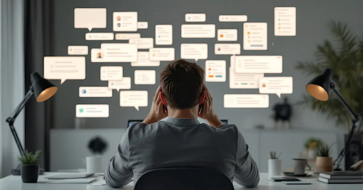
If there isn’t a book titled “How to Piss Off Website Visitors and Alienate People”, someone should write it. Maybe I could even start the first chapter with the words “In the beginning, the internet was a place of discovery and convenience. Then came the sliders, pop-ups, and subscription traps.”
The thing is, every one of these annoyances is born out of someone trying to be clever. But clever isn’t always user-friendly, is it? Let’s break down the usual suspects.
Sliders with Text
The modern website equivalent of someone talking at double speed. You’re squinting to read the first line when suddenly – boom – it’s gone, replaced by a stock photo of smiling office workers. Who decided this was a good idea? If you want visitors to engage with your content, give them time to bloody read it.
Hidden Text and Clicky Tabs
Why is everything tucked behind toggles and accordions? Are we meant to feel like Indiana Jones, uncovering secret treasures? Just put the text out there! If someone’s already clicked to visit your site, they shouldn’t need to solve a puzzle to get the information.
Pop-Ups (All Variants)
The heavyweight champion of user irritation. The “Subscribe Now!” pop-up, arriving with all the grace of a sledgehammer before you’ve even finished loading the homepage, is particularly egregious.
The sheer audacity to ask for a commitment when we haven’t even been wined and dined by your content yet!
Then there’s the social proof pop-up – “Barry from Lincoln just bought this thing you don’t care about” – oh, cheers, Barry, let me stop everything I’m doing to celebrate your achievement.
Back-Button Hijackers
This one feels personal. A deliberate act of war against anyone trying to leave. Adding five layers of fake history entries just to stop someone escaping is like locking a shop door and forcing the customer to browse longer. It’s not clever; it’s petty.
The Exit-Free Pop-Up
The ultimate power play. “You’ll read this newsletter offer or else!” And where’s the tiny, faint, grey-on-grey ‘X’ button that might let you close it? Oh, there isn’t one. Now you’re rage-quitting, heading straight to a competitor’s site.
The Real Problem with Clever Website Elements
The big issue here is a lack of empathy. Websites aren’t built for visitors anymore; they’re built for metrics.
Get the email address, grab the data, make them stay longer – all at the expense of a decent experience.
The irony is, by focusing so much on “engagement tactics”, they end up driving people away. It’s counterproductive, but try telling that to someone obsessed with their bounce rate.
If your website makes people feel trapped, bombarded, or just plain annoyed, they’ll leave – fast!
Done is better than perfect and it’s certainly better than being clever. 😉
Rant Worthy?
Well that was a proper rant-worthy topic, wasn’t it? The internet was supposed to make life easier, but some of these websites feel like a booby-trapped treasure hunt designed by someone with a grudge.
If it gave you a laugh and hit the nail on the head, then job done.
For Those Who Love a Quick FAQ Fix
Why do sliders annoy website visitors?
Because they’re like someone flipping through TV channels while you’re trying to watch – frustrating and impossible to keep up with. If your visitors can’t read the text before it changes, they’ll just leave.
What’s the problem with pop-ups?
Pop-ups demand attention at the worst possible moments. Asking someone to subscribe before they’ve even read a word of your content is like proposing on a first date. Desperate and awkward.
Are back-button hijackers really that bad?
Yes. It’s a dark art of web design, and it’s infuriating. If you’re forcing visitors to press ‘Back’ six times to escape your site, you’re not clever – you’re annoying.
What about those exit-free pop-ups?
They’re the internet equivalent of a locked room. No one wants to feel trapped, and those “Subscribe or Else” pop-ups scream desperation. Visitors will find the real escape. It’s called the back button.
Aren’t ‘social proof’ pop-ups meant to help?
In theory, yes. In reality, they’re just distractions. Barry from Lincoln might be thrilled with his purchase, but most visitors don’t care – they just want to read your page in peace. Including social proof in pages and posts is good. Having them as annoying pop-ups is not.
What’s the biggest takeaway for website owners?
Empathy. Build your site for real people, not just metrics. If you focus on creating a smooth, pleasant experience, visitors are more likely to stick around and engage naturally.
Bonus Gem: Hiding the Scrollbar
If you made it this far, you are an awesome person so here’s one more for the Hall of Fame of Website Annoyances: hiding the scrollbar. Why? Does it ruin the design to let the reader know how far down the page they’ve gone or how much is left to read? Of course not.
One of the worst examples I came across was – ironically – a website all about creating content. They absolutely know a thing or two about words, but usability? Absolutely clueless – clearly. The scrollbar wasn’t just ignored; it was deliberately hidden as if showing it would tarnish their “perfect” design.
Scrollbars aren’t the enemy. They’re a tiny, useful tool that shows readers where they are on a page. Blooming useful when you’re reading a page that feels like a chore to read, we want to know how much more drivel we have to get through before we can bail out. Stripping that away in the name of design isn’t just daft; it screams, “We care more about appearances than your experience.”
Honestly, it’s the cherry on top of the frustration cake. So if you’re thinking of hiding your scrollbar, don’t. Just… don’t.